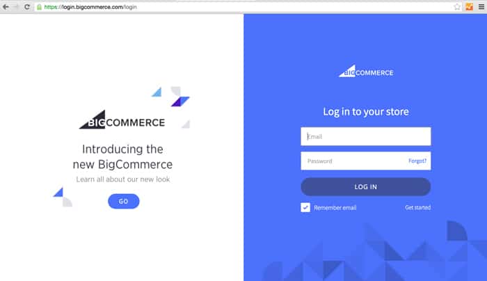
Have you noticed Bigcommerce’s updated login screen?

If you are a regular user of their platform, then you most likely have noticed that starting today there is a new Login Screen to your Bigcommerce store.
The new Logo and the overall branding of this page follows the change that Bigcommerce has been working on. Also, the login form was moved from the LEFT to the RIGHT of the screen.
Overall it has the exact same functionality as before, utilizing half of the screen (on desktop) for promotional messages and announcements. On Mobile it is the bottom half that will be utilized this way.
What do you think about the rebranding of Bigcommerce and their new Login Page? Leave your comments below.
Trepoly
eCommerce Web Design and Development Company helping businesses succeed online. "We make it EASY to sell online!"

